Responsive Web Design par ContentSide
Qu’est ce que le Responsive Design ?
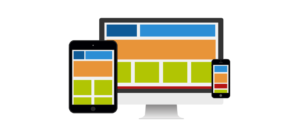
Le Responsive Web Design (RWD) est une approche de conception Web pour créer des sites Internet qui fournissent une visualisation optimale, une lecture facile et une navigation adaptée pour une large gamme de périphériques (ordinateur de bureau, ordinateur portable, téléphones mobiles, tablettes, …).
Quel problème le Responsive Web Design adresse?
Le spectre de tailles d’écran et de résolutions s’élargit chaque jour, et la création d’une version du site Internet spécifique pour chaque support n’est pas une solution envisageable. C’est le problème que le Responsive Web Design résout.
Quelle est la technologie du Responsive Web Design ?
Le Responsive Web Design est complexe, c’est un ensemble de techniques et d’idées qui forment un tout. Nous détaillons les principales techniques ci-dessous.
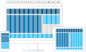
Responsive Grids
Le Responsive Web Design utilise une technique qui est connue sous le nom de grille fluide. Les grilles fluides sont plus avancées que les grilles traditionnelles. Au lieu de concevoir une mise en page basée sur les pixels rigides ou des valeurs de pourcentage arbitraire, une grille fluide est plus soigneusement conçue en termes de proportions. De cette façon, quand un visuel est compressé sur un appareil mobile ou étiré sur un écran géant, tous les éléments de la mise en page seront redimensionnés en conséquence.
La grille fluide peut être basée sur un nombre de colonnes différentes. La plus populaire est la grille de 12 colonnes.
source : https://twitter.github.io/bootstrap
La grille peut être utilisée comme dans l’exemple ci-dessous :
Media Queries
La deuxième partie du Responsive Web design sont CSS3 Media Queries. Ils sont mis en œuvre dans de nombreux navigateurs modernes (IE9 et 10, Firefox, Chrome, Opera, Safari…). Si vous n’êtes pas familier avec CSS3 Media Queries, ils permettent essentiellement de collecter des données à propos de l’appareil utilisé par le visiteur du site et de les utiliser pour appliquer les différents styles CSS. Pour nos besoins, nous nous sommes principalement intéressés à la fonctionnalité de média min-width et max-width, qui nous permet d’appliquer des styles CSS spécifiques si la fenêtre du navigateur est inférieure à une largeur particulière que nous voulons spécifier. Si nous voulions appliquer un certain style pour les utilisateurs de téléphone mobile, notre Media Query pourrait ressembler à ce qui suit.
/* Smartphone */
@media (max-width: 480px) {

  .content {
    margin: 10px;
    color: #000;
  }

  .navbar {
   background-color: #de0000;
}

  .article {
    display: block;
  }

  // etc...

}
En utilisant une série de médias de ce genre, nous pouvons travailler pour des grandes résolutions. La liste des largeurs d’écran peut être comme suit :
/* PC, ordinateur portable */
@media (min-width: 1200px) { ... }

/* Tablette */
@media (min-width: 768px) and (max-width: 979px) { ... }

/* Smartphone et Tablette */
@media (max-width: 767px) { ... }

/* Smartphone */
@media (max-width: 480px) { ... }
Responsive Web Design Frameworks
Responsive Web Design CSS Frameworks contiennent des styles prédéfinis et préconfigurés. Ils ont une collection d’outils pour créer un design pour les web-pages et web-apps. Ils aident à développer plus rapidement et plus facilement.
Nous détaillons les frameworks les plus populaires ci-dessous.
Twitter Bootstrap (gratuit)
Twitter Bootstrap est le framework le plus fréquemment utilisé pour développer en Responsive Web Design.
Le framework utilise le préprocesseur CSS – LESS, mais il existe une version pour SASS/SCSS.
Twitter Bootstrap existe en deux versions pour le moment :
- Bootstrap 2.3.2 – version stable
- Bootstrap 3 – version Release Candidate
Twitter Bootstrap :
- a une large communauté d’utilisateurs
- utilise le système de grille fluide de 12 colonnes
- supporte tout type d’appareil, toute résolution et toute taille d’écran
- est très riche en composant:
- Les menus déroulants
- Boutons, groupes de boutons
- Navigation
- Breadcrumbs
- Pagination
- Typographie
- Étiquettes et badges
- Miniatures
- Alertes
- Les barres de progression
- Les objets des médias
- Les onglets (Tabs)
- et propose un mécanisme d’extension. Beaucoup de plugins existent déjà:
- Transition
- Modal
- Tab
- Tooltip
- Popover
- Collapse
- Carousel
- Typehead
- Scrollspy
Twitter Bootstrap permet de télécharger une version personnalisée du framework où l’on sélectionne les modules à embarquer.
ZURB Foundation (gratuit)
ZURB Foundation est le deuxième plus populaire framework pour développer en Responsive Web Design.
Le framework utilise le préprocesseur CSS – SASS/SCSS. Il n’existe pas de version pour LESS.
ZURB Foundation existe en deux versions pour le moment :
- Foundation 4 – version stable
- Foundation 5 – version en cours de développement
ZURB Foundation:
- a une communauté d’utilisateurs assez importante
- utilise le système de grille fluide de 12 colonnes
- supporte tout type d’appareil, toute résolution et toute taille d’écran
- est lui aussi très riche en composants :
- Les menus déroulants
- Boutons, groupes de boutons
- Navigation
- Breadcrumbs
- Pagination
- Typographie
- Étiquettes et badges
- Miniatures
- Alertes
- Les barres de progression
- Les objets des médias
- Les onglets (Tabs)
- Panels
- et propose aussi un mécanisme d’extension où l’on trouve déjà:
- Transition
- Modal
- Tab
- Tooltip
- Popover
- Collapse
- Carousel
- Typehead
- Scrollspy – Magellan
- Tournée – Joyride
Zurb Foundation permet de télécharger une version personnalisée du framework où l’on sélectionne les modules à embarquer.
Liens externes :
Pour approfondir le sujet, nous recommandons les ressources suivants :
« Responsive Webdesign – présent et futur de l’adaptation mobile »
« The Ultimate Responsive Web Design Beginners Resource List »
https://www.targetlocal.co.uk/responsive-web-design-resources/
« Make the mobile web better: Don’t make these 4 responsive-design mistakes »
« Les Media Queries CSS3 »
https://www.alsacreations.com/article/lire/930-css3-media-queries.html
« Logique dans media queries »
https://css-tricks.com/logic-in-media-queries/
« Responsive Web Design communauté sur Google+ »
https://plus.google.com/u/0/communities/108447980678861671911
« Comparaison de Responsive CSS Frameworks »
https://responsive.vermilion.com/compare.php
Mathieu PALONEK
Ce sujet vous intéresse ?