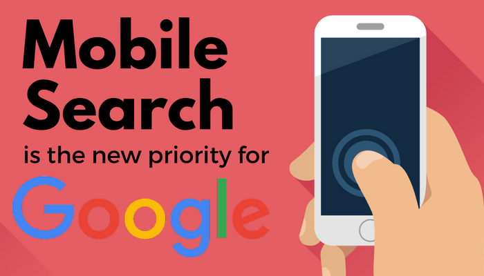
Mobile-first without hesitation to exist in the eyes of Google
Put your company in pole position!
Although it is not very pleasant to be dependent on Google, it is essential to think about the future of your site in relation to the American company in order to be sure of always being visible on the web. The web giant forces you to take into account its evolutions for the good communication of your company.
A poorly indexed site has little chance of appearing in the results of a search engine and will be very disappointing. Accessibility to information and therefore to the company is not something to be taken lightly, which is why you should think about switching to mobile-first.
Think "User".
Are you still hesitating? Whether in the street, the metro, the bus or simply at home, more and more users consult websites from their smartphone. And for this reason, in the interests of conversion rates and ergonomics, a good UX Designer will agree that a Responsive Web Design site should be favoured. The best way to make a site pleasant, accessible and effective is to look at the habits of users and therefore start with the choice of the most used device.
Is your site already on mobile?
Perfect, you've got it all figured out! But be careful to have the same content on mobile and desktop, or you risk being left out by Google. The problem can also be the case of sites using a different code depending on the device.
This is why it is recommended to have a site in Responsive Web Design, which has the same URL, HTML codes and content on mobile and desktop, and will therefore have nothing to fear.
Creating a Responsive Web Design site does not mean having a mobile version in addition to the desktop version, but rather writing the HTML so that the site adapts to the user's device. Responsive Web Design is a smart solution that does not require a significant additional cost to creating a desktop site. It remains much cheaper than a mobile application and allows to cover both desktop and mobile users.
Still not convinced?
If you think that a mobile-friendly site is not enough to showcase your content, think again! Take a look at ContentSide 's! Whether it's desktop or mobile, the same content can be promoted.
Want to know all about Responsive Web Design or get some UX related tips? You might be interested in these articles:
- Responsive Web Design by ContentSide
- Desktop ergonomics, tips to know (coming soon)
Are you interested in this topic?