Usability analysis of political websites
Now that the left-wing primaries have just ended, the presidential candidates will have to do their best to have an efficient communication that speaks to the French. I had fun looking around the official websites of the different parties to make up my mind. I came across a few surprises that I decided to share ...
Let's take a look at some of the applications of this means of communication that are sometimes poorly thought out and that consequently have major usability problems. UX Design (User Experience) put to the test!
A quick reminder of the ergonomics of a website
A site is said to be "ergonomic" when it is efficient and brings satisfaction to the user who browses and uses it. To do this, it must have clear content, be attractive, easy to use and preferably respect certain standards. As aUX Designer at ContentSide, I take all these aspects into account when carrying out my ergonomics missions.
Socialist Party
Let's start with the Socialist Party website.
At first glance, the home page seems well constructed, with attractive content, not too long, allowing for easy and quick reading of the information. This is the most important page of a website. It has some mistakes here that can cost it dearly.
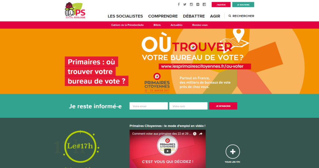

Too many colours:
Here the message is not highlighted in the right way. The choice of colours is not good, in fact the orange here is too close to red and the white text becomes difficult to read. Added to this is a very large, poorly spaced text which amplifies the poor reading of the information. In addition to this, white, red, orange and different shades of green follow one another on the same page, which results in the Internet user getting lost in this too varied panel of colours. It would have been better to limit the number of colours to a maximum of 3 in order to rest the eye and allow the information to be read correctly.
Not sure that voters clicked much on this banner...
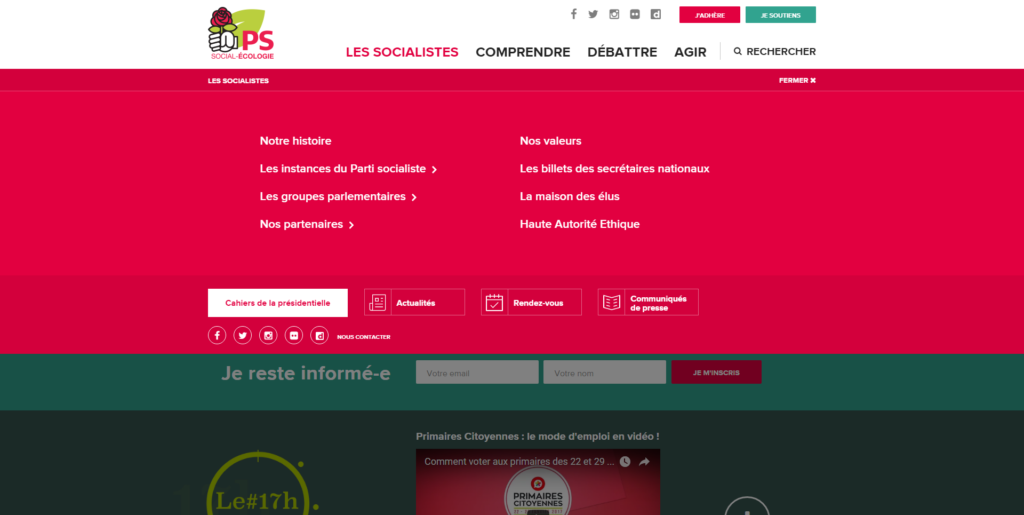

Catch-all navigation:
Although the navigation seems to be classical, on closer inspection it is not very intuitive and loses the user a little. Indeed, it combines different levels of navigation in a drop-down menu that refreshes and replaces the content while displaying a breadcrumb trail. Surprising since there has not yet been a redirection to a desired page. Why would you want to invent new and somewhat risky behaviours (unless you are called Facebook or Amazon) when the web standards are there to guarantee a pleasant user experience? In this case, it is advisable to implement a simple navigation with tabs and a few redirection links corresponding to the selected heading/tab.
We can also find the social network sharing which is already visible in the header, links already present in the general header navigation and a close button which merges with the present links and loses its interest since a simple click on the parent section closes the menu.
So this menu is too full, mixing links, animations and various functionalities. It would have been preferable to have only the links directly linked to the selected section for a better understanding, and thus reduce the height of the menu, thus gaining in readability. It is therefore essential to keep in mind "keep it simple" to be efficient and to lead the user quickly to where he wants to go.
The Republicans
Although the Republican website is better constructed and puts forward better information than its direct opponent, it is not infallible. And for good reason!
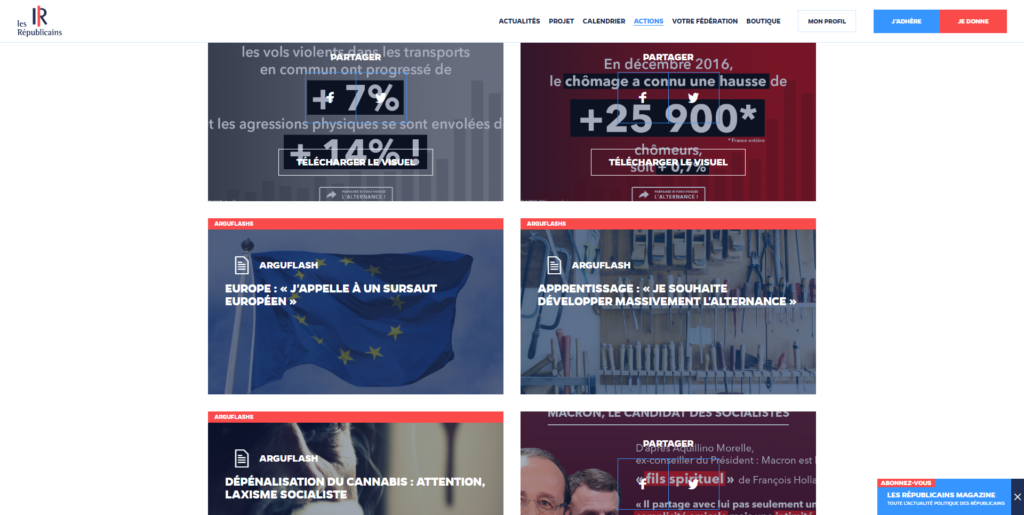

Headache-inducing sharing:
Sharing content is a good way to spread a speech or an idea, but it has to be done correctly. On this page, there is a succession of images with redirection links and shares/downloads. The images offering a redirection are well highlighted with a white text on a background image. But as for the images to be shared or downloaded, it is not easy. Indeed, the action buttons represented by white text are superimposed on images that also contain white text. This pretty mix disturbs the reader's understanding of where to look, where to click.
It would have been preferable to use coloured background buttons to further distinguish the buttons and thus the associated actions.
The list is far too long:
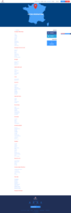 On this page, the user is confronted with a never-ending list of links. The user has to scroll endlessly through the page to get to the department they are looking for. The user is then redirected to the page with the contact details of the department's representatives. Such a long list can discourage the user from continuing his search and therefore his presence on the site is reduced. The presence of filters to search for a department according to its region and/or keywords and the display of contact details directly on the page could be a better way of easily finding the desired information.
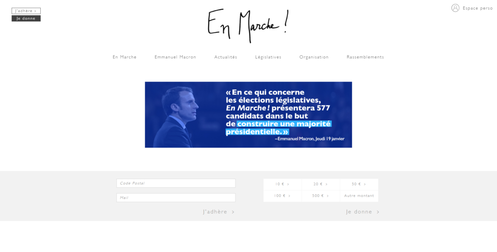
La République en Marche!
La République en Marche ! is taking the approach of a streamlined site with a strong focus on information. The site* of Emmanuel Macron's party risks being a little too effete compared to the other candidates.
* Old party website updated since the publication of this article.
Poorly structured buttons and texts:
Although the home page has a very powerful teaser message because it is highlighted by the only colour on the page, this is not a good choice. Because the features, articles, etc. following the message are not visible (only one colour used, buttons on a white background like the texts). It would have been preferable to use a wider range of grey-black shades in order to differentiate and therefore structure the titles, subtitles, texts and buttons. On this homepage, the user will certainly see the candidate's message, but it is not certain that he/she will notice that he/she can also make a donation. A pity for a candidate who only wants to assert himself...
National Gathering
In trying to distinguish itself, the Rassemblement National has lost its way in the ergonomics of its website and must surely be losing its readers.
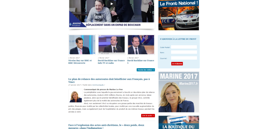
Site structure not adapted :
Here the user risks being disoriented by the structure of the site, which has nothing political about it, and could then confuse it with a press site and consequently leave it. This choice has surely been made after a moment's reflection, but it is not sure that it is the best one to promote the party's ideas.
Non-responsive site :
A big ergonomic mistake is to offer a user a site that does not adapt to the size of his device. Indeed, here the site sees its content frozen, which does not allow a simple and pleasant reading when the user consults the site on a mobile for example. Nowadays, where technology is omnipresent with different screen sizes, it is imperative to conceive one's website taking into account the responsive design, especially when addressing a large audience.
Ineffective footer:
A footer is present on each page of the site, but it is not used to good effect. Indeed, it does not properly highlight the web standards and loses its interest, which is to remind the essential features of the site and to allow contact. Here the features are lost with a news feed and Marine Le Pen's twitter widget. It may take a while before the user can contact the party, for example. Moreover, an essential element is missing: social networks. Indeed, no sharing or social network tracking functionality is present in the footer (or elsewhere on the site). It would have been preferable to reduce the number of news and tweets displayed in order to have a less imposing footer and to put more emphasis on the site's features. As for the access to the party's social networks, it should have been added in the footer and header.
By wanting to give a lot of information, the Internet user no longer finds his way.
The Democratic Movement
The Mouvement Démocrate has also taken the approach of an original site format without responsive design. However, the element that could help it gain some points is the use of a "single page". Although this format is modern and effective in delivering information quickly to visitors, it is not enough.
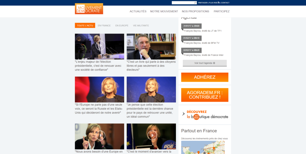
Blog format :
The site is structured in two columns, which makes it look like a blog. This can confuse a user who might not find the site "serious" enough. In addition, the right-hand column is far too imposing, the buttons are very prominent and become almost illegible. As a result, they take precedence over the elements on the left.
Buttons not highlighted enough:
Unlike the PS, LR and FN seen above, the Modem has not put buttons at the top right of the header to access a feature. This is a hindrance to the acquisition of donations for example, because this location is strategic and very visible. It is therefore interesting to use it.
In conclusion
Before building a website, it is essential to think about its ergonomics and apply good practices and standards. By applying the usability guidelines mentioned in this article, the candidates' websites could have seen their number of clicks boosted and, moreover, their web communication made more effective!
In the meantime, here is a summary of the recommendations encountered:
- Do not use colours that are too close or too bright on all backgrounds
- Do not have a navigation that refreshes in the drop-down menu
- Have a simple and airy menu
- Do not add text to an image that also contains text
- Use coloured backgrounds to highlight buttons where appropriate
- Prefer a list of results with filters rather than a list that is too long
- Have between 2 and 3 colours or shades of the same colour for the graphic charter
- Add links to the main features of the site in the footer
- Display social network sharing and tracking buttons
- Do not overfill the footer
- Use the top right corner to add links to important features
Are you interested in this topic?